Mastercard Click to Pay
Case Study: Designing for Mastercard Checkout Services (SRC)
Overview
As a Product Designer, I worked on Mastercard’s Checkout Services (SRC) — a global initiative to simplify and secure online payments. My role was to address critical usability and trust challenges in the digital checkout process while ensuring alignment with industry standards and merchants’ needs.
The Challenge
Despite Mastercard SRC’s promise of a frictionless, secure checkout, early adoption revealed several key problems:
- Complexity for Users
- Customers were unfamiliar with SRC branding and confused about what it was.
- Checkout flows varied between merchants, leading to inconsistency and drop-offs.
- Trust & Transparency
- Shoppers hesitated to enter credentials due to unclear messaging about security and data use.
- The visual design did not yet reinforce Mastercard’s reputation for safety.
- Merchant Integration Pain Points
- Merchants found it difficult to adopt SRC without disrupting their existing checkout experience.
- Developers needed clearer integration guidelines and design patterns.
My Role
I led the user experience design efforts, collaborating closely with product managers, engineers, and Mastercard’s compliance/security teams. My focus was to:
- Conduct user research and map the current checkout journey.
- Identify key friction points for both consumers and merchants.
- Redesign the checkout interface and design system for clarity, consistency, and trust.
Process
1. Research & Insights
- Conducted usability tests across multiple merchant checkout flows.
- Analyzed cart abandonment rates tied to confusing entry points.
- Interviewed merchants and developers about integration challenges.
Key Insight: Shoppers needed reassurance and familiarity, while merchants needed flexible, plug-and-play patterns.
2. Defining the Design Goals
- Simplicity: Reduce clicks and streamline checkout steps.
- Trust: Reinforce Mastercard’s role as a secure payment provider.
- Scalability: Ensure the design system could adapt across global merchants and devices.
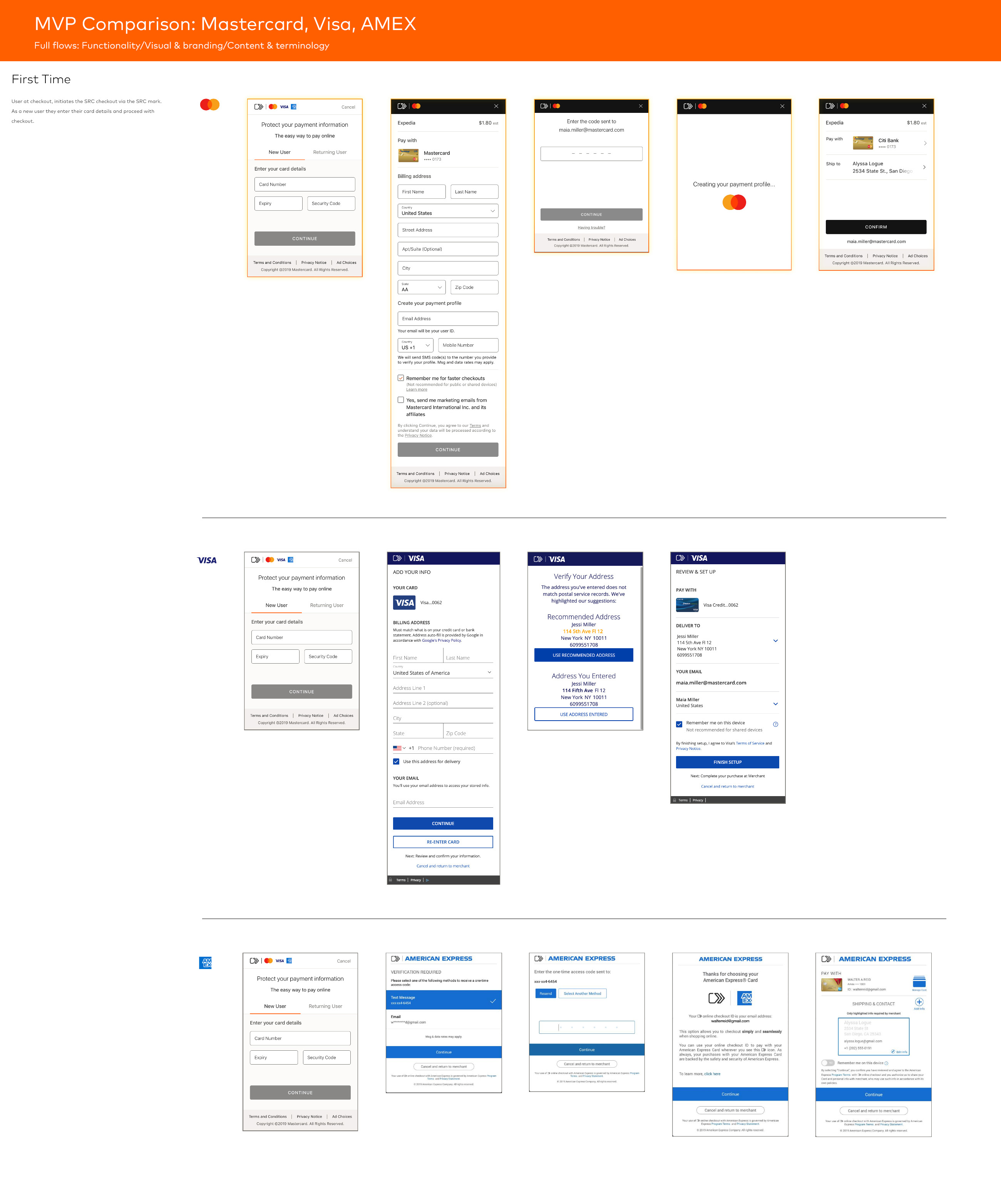
3. Design Solutions
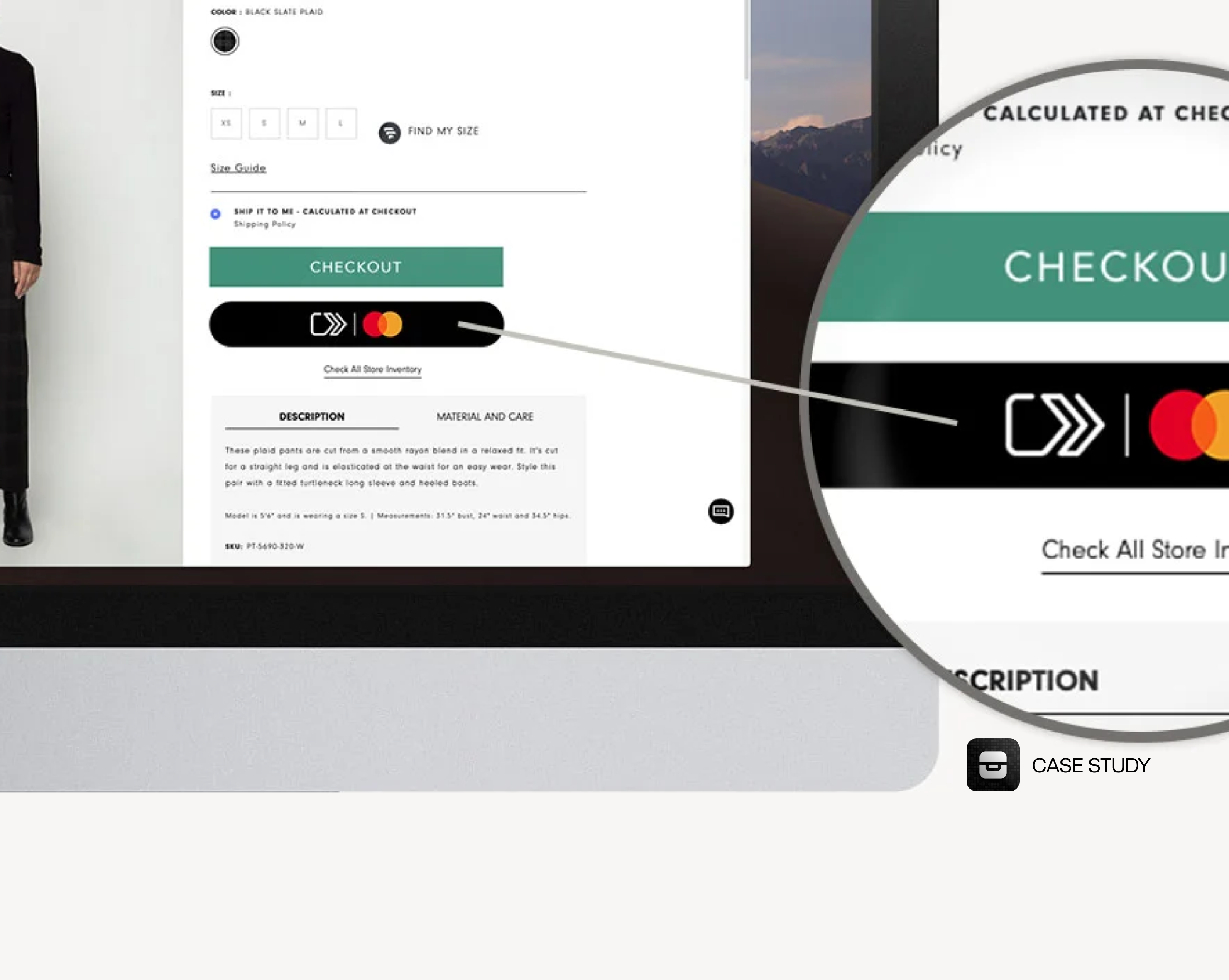
- Unified Checkout Button
- Introduced a branded, consistent “Click to Pay with Mastercard” button recognizable across merchants.
- Used strong Mastercard visual cues (logo, colors) to build trust.
- Streamlined User Flow
- Reduced checkout steps by auto-filling stored credentials.
- Designed clear progress indicators to keep users oriented.
- Security Transparency
- Added microcopy that explained how SRC protects card data in plain language.
- Designed trust badges and animations to reinforce real-time security checks.
- Merchant-Friendly Integration Kit
- Built a component library with flexible UI modules for merchants.
- Created responsive patterns ensuring consistency across web and mobile.

Outcomes
- 30% reduction in checkout abandonment during pilot testing.
- Positive feedback from merchants citing easier integration.
- Increased consumer trust in SRC due to improved messaging and branding.
Designing for Mastercard SRC required balancing consumer trust, merchant needs, and compliance with global payment standards. The project taught me how to design within heavily regulated ecosystems while still advocating for simplicity and user-centric design.