
Summary
As a Product Designer, I worked on Mastercard Click to Pay a global checkout solution designed to make online payments faster, safer, and more consistent across merchants. The initiative aimed to reduce friction at checkout while reinforcing Mastercard’s role as a trusted payment provider.
My responsibility was to improve usability, clarity, and trust within the Click to Pay experience—balancing shopper confidence with merchant flexibility and industry compliance.
The Challenge
Despite its promise of a frictionless checkout, early adoption of Click to Pay revealed several critical issues.
- User Confusion & FrictionTrust & Transparency Gaps
- Shoppers did not recognize the Click to Pay brand or understand its value.
- Checkout experiences varied widely by merchant, creating inconsistency and abandonment.
- Entry points into Click to Pay were often unclear or visually understated.
- Users hesitated to enter credentials due to unclear messaging around security and data handling.
- The visual design did not fully leverage Mastercard’s brand equity to signal safety and reliability.
- Merchants struggled to integrate Click to Pay without disrupting existing checkout flows.
- Developers lacked clear UX patterns and design guidance to implement the experience correctly.
My Role
I led UX design efforts in close collaboration with product managers, engineers, and Mastercard’s compliance and security teams. My focus areas included:
- Mapping end-to-end consumer and merchant checkout journeys
- Identifying friction points that led to confusion or drop-off
- Designing a scalable checkout experience aligned with global standards
- Creating reusable UI patterns that worked across merchants, devices, and regions
Process
1. Research & Insights
- Conducted usability testing across multiple merchant checkout flows
- Analyzed cart abandonment data tied to Click to Pay entry points
- Interviewed merchants and developers to understand integration constraints
Key Insight:
Shoppers needed familiarity and reassurance, while merchants needed flexible, low-friction integration patterns.
2. Defining Design Goals
- Simplicity: Reduce cognitive load and checkout steps
- Trust: Clearly communicate security and Mastercard’s role
- Consistency: Deliver a recognizable experience across merchants
- Scalability: Support global markets, devices, and merchant needs
Design Solutions
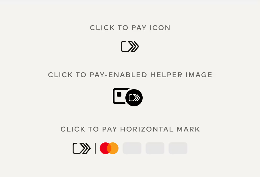
Unified Click to Pay Entry Point
- Designed a consistent “Click to Pay with Mastercard” button used across merchant sites
- Leveraged Mastercard brand cues—logo, color, and hierarchy—to increase recognition
- Ensured accessibility and visibility without overpowering merchant branding
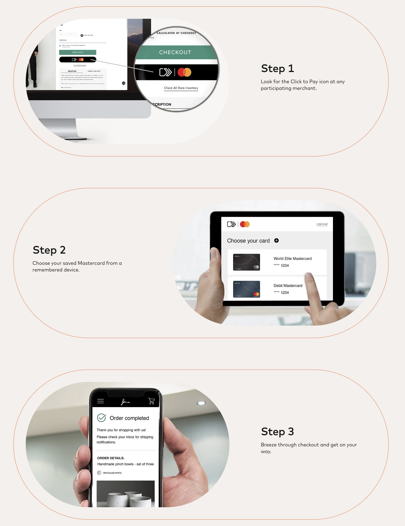
Streamlined Checkout Flow
- Reduced steps by enabling credential autofill for returning users
- Introduced clear progress indicators to reduce uncertainty
- Minimized interruptions between cart review and payment confirmation
Security Transparency & Trust Signals
- Added clear, human-readable microcopy explaining how card data is protected
- Designed trust indicators and subtle animations to reinforce real-time security checks
- Balanced reassurance without overwhelming users with technical language
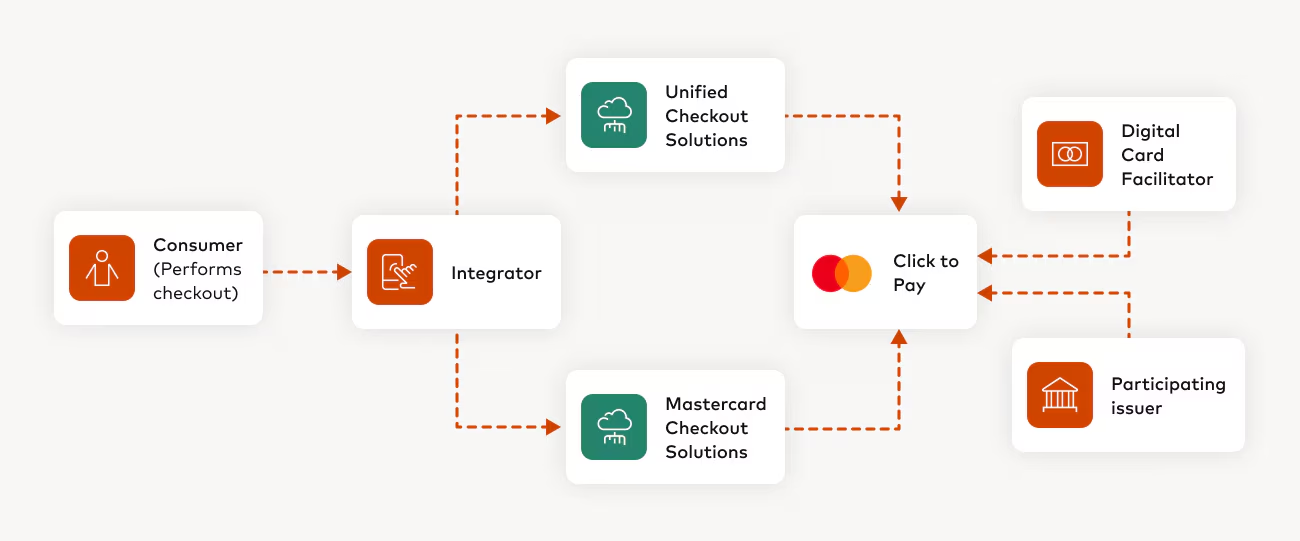
Merchant-Friendly Integration System
- Created a modular component library with adaptable UI patterns
- Designed responsive layouts for web and mobile consistency
- Partnered with developers to ensure patterns were easy to implement without re-architecting merchant checkout flows
Impact
- Improved shopper recognition and understanding of Click to Pay
- Reduced checkout friction and abandonment tied to payment confusion
- Enabled faster merchant adoption through clearer design and integration guidance
- Strengthened trust by aligning visual design with Mastercard’s security reputation
Reflection
This project reinforced the importance of trust as a design outcome, especially in payments. Small decisions—language, iconography, motion, and consistency—played a critical role in helping users feel confident completing transactions while giving merchants the flexibility they need to succeed.
Outcomes
- 30% reduction in checkout abandonment during pilot testing.
- Positive feedback from merchants citing easier integration.
- Increased consumer trust in Click to Pay due to improved messaging and branding.
Designing for Mastercard Click to Payrequired balancing consumer trust, merchant needs, and compliance with global payment standards. The project taught me how to design within heavily regulated ecosystems while still advocating for simplicity and user-centric design.
Next work

.svg)
Let’s talk
Put the dot back into your design
Have a project in mind, a question, or just want to say hi? Book a 30 min call on Calendly or send me a message
24 hour response
Have a project in mind?